Evaluating early literacy game design
Role: UX Research, Product Design
Outcome: Identified critical usability issues through age-appropriate testing, leading to product design revisions that improved the learning experience and reduced early user drop-off in the mobile app.
Context
WORD Force: A Literacy Adventure is a digital course to teach some of Everfi’s youngest students (K-2) early reading skills through 15 interactive games. In 2022, our product development team built a mobile app version of the originally web-based course.
Through usage analytics of the current course, we could see there was a significant drop off in engagement within just the first 3 games, but we didn’t know why. Our team knew this was a huge opportunity to not just copy/paste what we had into an app version, but revise and improve the games as we embarked upon this rebuild. And usability testing was the key to uncovering the why.
I helped our team embrace the challenge of running usability testing with an age group no one on my team, including myself, had ever worked with before: 5-7 year old kids!
Approach
In order to run at a pace that would allow me to deliver insights to the team as they were working real-time to rebuild the games, I settled on running unmoderated usability tests with 5 users per game. I developed a testing protocol than involved adapting my research methodologies to suit a significantly younger demographic, such as:
screening in adult participants that had children between the ages of 5-7 who were willing to have their child participate in the test with them
test guidance and explanation for parents to fully allow their child to play the games with minimal intervention, and only help when they were stuck
relying more heavily on observation of gameplay and less on follow-up questions
fewer, and much more simple follow up questions for parents to ask their kids to help verbalize their experience as much as possible
post-test questions for parents to provide more context and add their own feedback after their kids had a chance play the games on their own
Actionable insights, right away
After watching video results from testing just the first game, I could immediately see a number of major usability issues. Through rapid testing of nearly all of the 15 games, I was able to uncover insights that fed directly into actionable game revisions that I delivered to my team as they were working real-time to rebuild the WORD Force course. Here’s some highlights:
Game tutorials
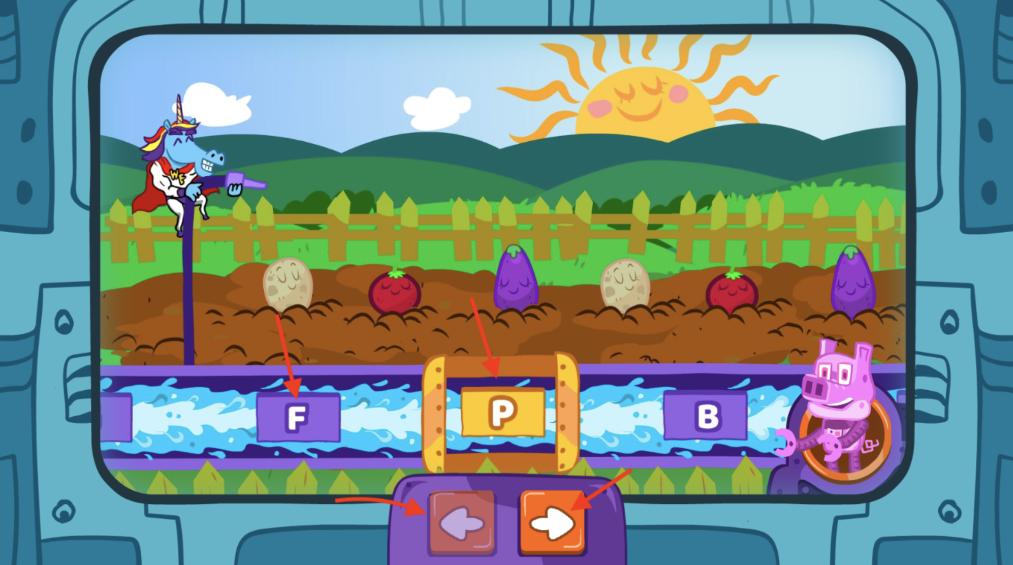
Our original in-game tutorials looked exactly like real gameplay, but were actually just still images of game screens. Because of this, both parents and children struggled with or got completely stuck during the tutorial because they didn’t understand what they were supposed to be doing or clicking, and often thought they were already playing the game. This was a major pain point for all users, and this frustration was likely a major cause of why we were seeing so much early drop off in the course.
User quotes
“What am I supposed to click?”
“Why isn’t this working?”
“It didn’t really let us play the game.”
“I guess the first part was just the instructions. We were trying to play the game, but it was just the instructions.”
Red arrows indicate the many places users were trying to click in order to get through the tutorial
Action: Our team prioritized overhauling our onboarding and tutorial experience across all games to be more intuitive, as well as added new direct instruction videos and level-specific interventions for students who need more guidance in the games.
Pacing and speed of games
Some of our games involved letters or words moving across the screen. For many users, the pacing and speed of our games were too fast. For some users who were more advanced, the pacing was sometimes too slow.
User quotes:
“The letters were so fast, I can’t click them.”
“It was difficult to click.”
“It was going way too fast I think.”
Action: We added speed controls that allow users to adjust games to their reading level (up or down).
Unclear images
We realized that a number of images we used across the games were unclear, either because of the way they were drawn (too abstract or unfamiliar) or because they could be referred to by multiple names.
From left to right/top to bottom: Some images were too too unclearly drawn like “gum” and “horn”; too unfamiliar like “wig”; or could be referred to by too many other names, for example “plug” was commonly called “cord” or “charger”
Action: Our learning experience and design team reviewed all of the game images with a fine-toothed comb for clarity and made revisions or replacements where necessary.
Difficulty using a mouse
I was also able to observe that for some children, using a mouse or trackpad on a computer to play the games was difficult. Kids ages 5-7 are rather new at using a computer, which none of us had really thought about! Some of our games involved complex actions like clicking and dragging which was particularly challenging and frustrating for our users.
Action: Our team adjusted game mechanics where necessary, for example instead of using drag and drop which requires a user to click, hold, and drag, we used a simple click to select + fill interaction.
Outcomes
As a result of leading this research study:
We shipped a v2 product that was not just in a new format, but solved numerous pain points in the process including reduction in early game drop-off so that our end users could have a smoother experience that led to more engagement, more learning, and more fun.
I supported my team in embracing a new challenge of testing with some of our youngest users.
I rapidly adapted my research approach and methodologies to better serve a particularly young audience (screeners, instructions, tasks, research questions).
I demonstrated that fast, iterative usability testing with just 5 users works to uncover the majority of major usability problems, even with users as young as 5 years old!


