Designing accessible, interactive learning experiences
Role: Accessibility, UX Research, Interaction Design
Outcome: Redesigned an interactive chart component through iterative accessibility research with AT users, creating a scalable and flexible experience that improved usability for all learners.
Context
At Everfi, we build our products using the components in our design system, which is a library of interactions and reusable blocks that can be used together in many different combinations. This case study highlights my accessibility work with our chart component and how my team and I worked together to make our data visualization more interactive and accessible at scale.
As a designer, I apply an an iterative and human-centered process. Throughout this case study you will see that close collaboration with people with disabilities who use assistive technology (AT) in their everyday lives is integral to the solutions we build.
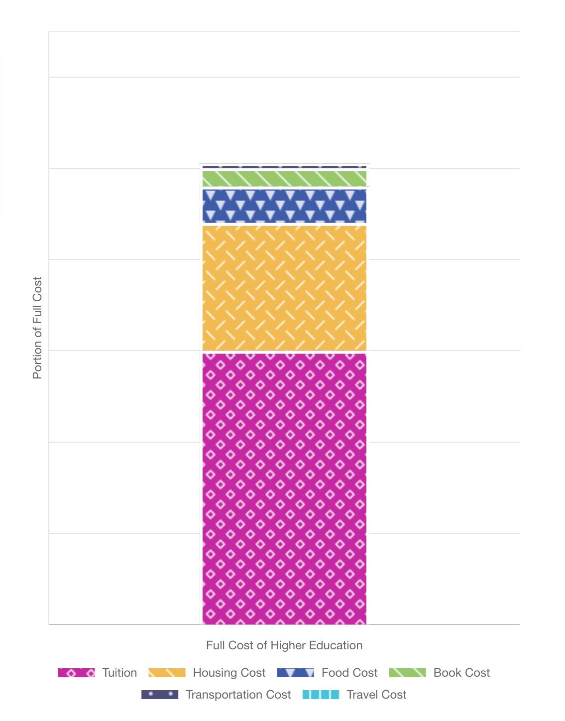
Using charts as core learning experiences
In our earlier products, our team used charts in ways that weren’t integral to the learning experience. They were mostly static objects, and alt text or long descriptions were added for accessibility.
As we started designing courses in new topic areas such as data science, our team started using charts as core interactions and learning experience (LX) patterns.
This presented us with an opportunity to start thinking of different ways we could make this component an interactive and accessible experience for all of our learners.

Interactive controls and visual accessibility
Our first iteration included:
Upgrading our component to use a more interactive chart
We applied the same a11y standards as for our other interactive content so we were no longer treating charts like a static image
Improving the visual a11y to support better usability for users with low vision and color-blindness, such as:
Color contrast
Labels
Patterns
User feedback: “Data needs to be presented in a table”
“This information really needs to be in a table to make more sense, because I'm forced to make assumptions here [about the data].”
When usability testing the new features with some of our screen reader (SR) users, we received feedback that some of the more robust SR announcements and controls that were added into the component were actually causing some confusion.
Insight: The chart announcements were repetitive, overwhelming, and not providing the information in a usable way.
Action: Add an alternate view that presents the data in a table.
Adding a table view
Our second iteration included:
Adding a “Table View” to the chart component, which was a button that opens a modal that has all of the same data from the chart in a table format
User feedback: “This is probably a mirror image of the graph”
“Someone using a screen reader should not have difficulty getting the data out of this table.”
We were able to validate this design by running more usability test sessions with screen reader users, and received feedback that helped validate this iteration.
Reducing cognitive load
However, we had another screen reader user give us a different piece of feedback while having a discussion about the feature in a moderated session, which was that not everyone is an expert assistive technology user, and that some people might not know how to use table commands to navigate through a table.
User feedback: “Not everyone is an expert AT user”
“Not all SR users know how to use JAWS to be able to navigate in a table"
During the session, they explained that if someone uses simple commands instead of table navigation commands, column headers will not be announced before each cell, which can create a lot of additional cognitive load because it requires the user to try to recall different pieces of information from memory.
Insight: We realized that although the table view offered a better experience of traversing data for many SR users, both the chart display and the table view presented information in a way that might create a high cognitive load for users.
Action: Facilitate interviews with screen reader users to explore the question, how might we design alternate views that presents the data in a simpler way?

Chart display

Table view
During one of our discussions about AT skill level and data, our participant said, “A beginning user may think well, this table is way too complicated for me, I just want a list of what’s on the y axis and what’s on the x axis.”
And from this thread of the conversation, a new idea emerged: let’s slice the data differently, in a way that allows users to take in one discrete piece at a time.
Designing additional alternate views
We developed a functional low-fi prototype that presented the same data several different ways to allow users to see what worked best. The options included:
Table view: we included the data in a table format, in order to test the new concepts against our current solution.
List: we formatted the data set as three separate but related, ordered lists.
Description: this option provided a data summary in the format of a written text description. This represented the data in a general sense, without providing every single number.
Data slicer: this concept was all about grouping the information in smaller, discrete pieces, so that instead of having to traverse a large chart or table where you’re going back and forth between cells or data units, here you can see we’ve grouped the information by month, and simply display both populations of the data at once to the user. This attempts to address feedback about “all the data at once” being too much, or confusing. For concept testing, we used buttons and popovers with the information because it was really quick to get set up.

Data slicer prototype
User feedback: “This is a good way of doing it”
“... because you get everything all in one shot instead of having to scroll tables and find out all of the data.”
Insight: The table view and our new concept of the data slicer were the preferred methods of reviewing data. The list format required users to have to remember too many values at once, and it turned into a what one user described as a memory game.The description that presented a data summary was okay, but not ideal, and one user commented that while it was a good way of describing data, they would prefer to have all the details instead of partial information.
Action: Create design specs to add another alternate view for the data slicer concept into the chart component, similar to how we added the table view.
Outcomes
When you center accessibility in your design approach, you end up creating solutions that benefit all of your users
These alternate views on our chart component don’t just benefit people with disabilities who might be using certain types of AT, but also offers more flexible learning experiences for everyone. Course concepts like data sciences are complex, and different ways to interpret data can help different kinds of learners reach the same outcome.
Pushing the accessibility solutions beyond the “standard”
By taking an iterative approach that emphasizes collaboration with people with disabilities, our team was able to push ourselves to create technology that is not just okay, but a great user experience for everyone, and promote a team environment that is open to continuous research and change.

Image from Sketchplanations